Theme Settings
It is kindly recommended to take a look at the information below:
Customizing themes - official documentation
Language
You can find almost all texts in your admin panel in the Language section:
Please refer to the attached screenshots:
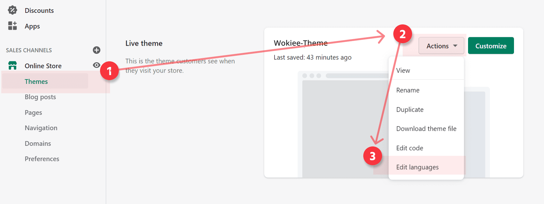
Almost all texts can be edited in the Shopify admin section, Edit languages chapter. Press all tabs and change the texts to yours.

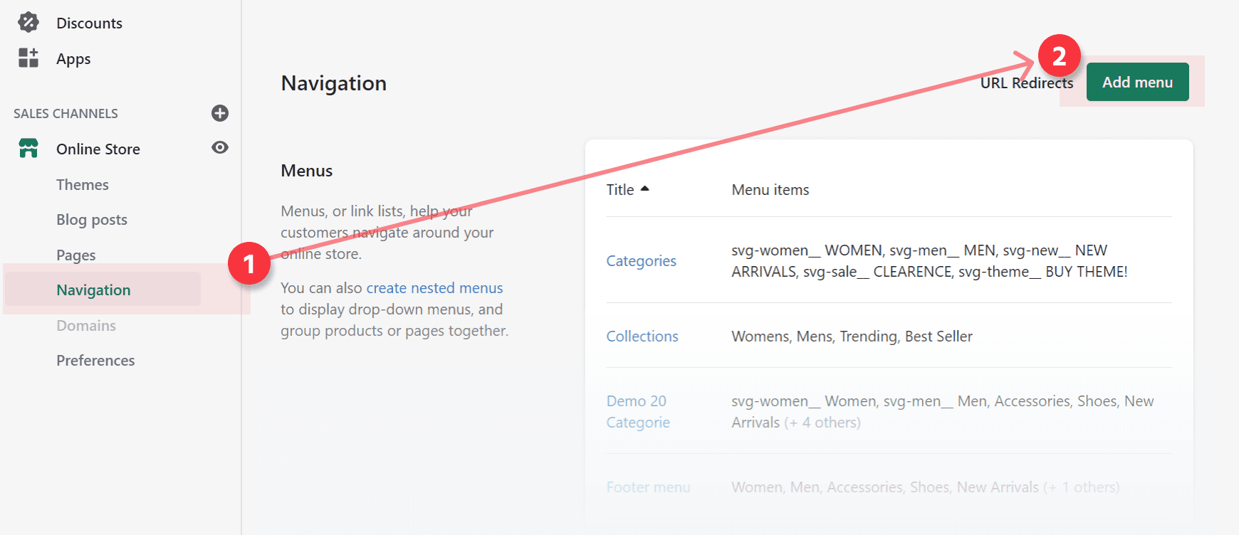
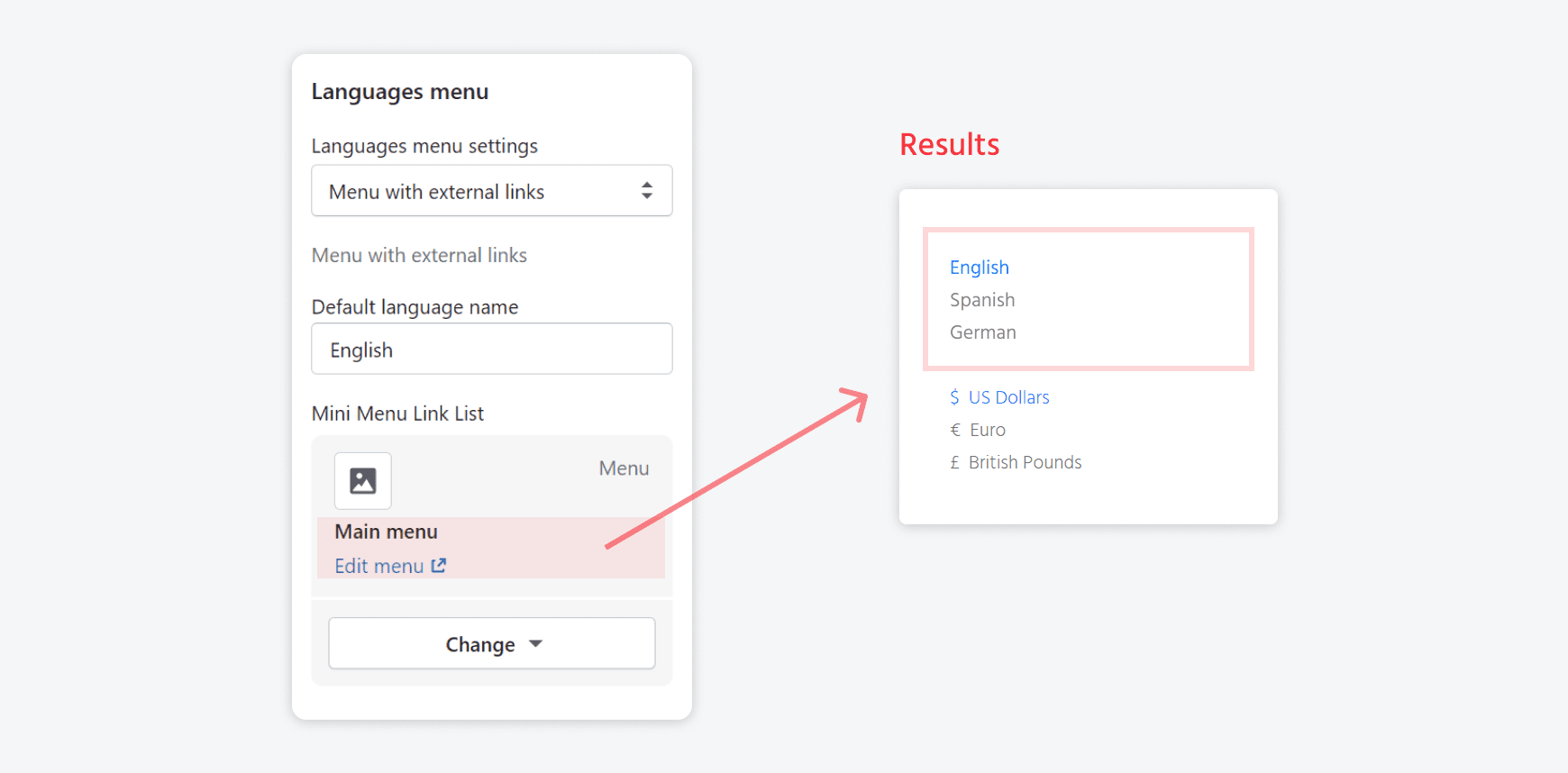
CREATE LANGUAGE SWITCHER IN SHOP
- Create a linklist menu with languages. Use external links in the menu::


- Keep in mind what menu is created as language menu in your admin.
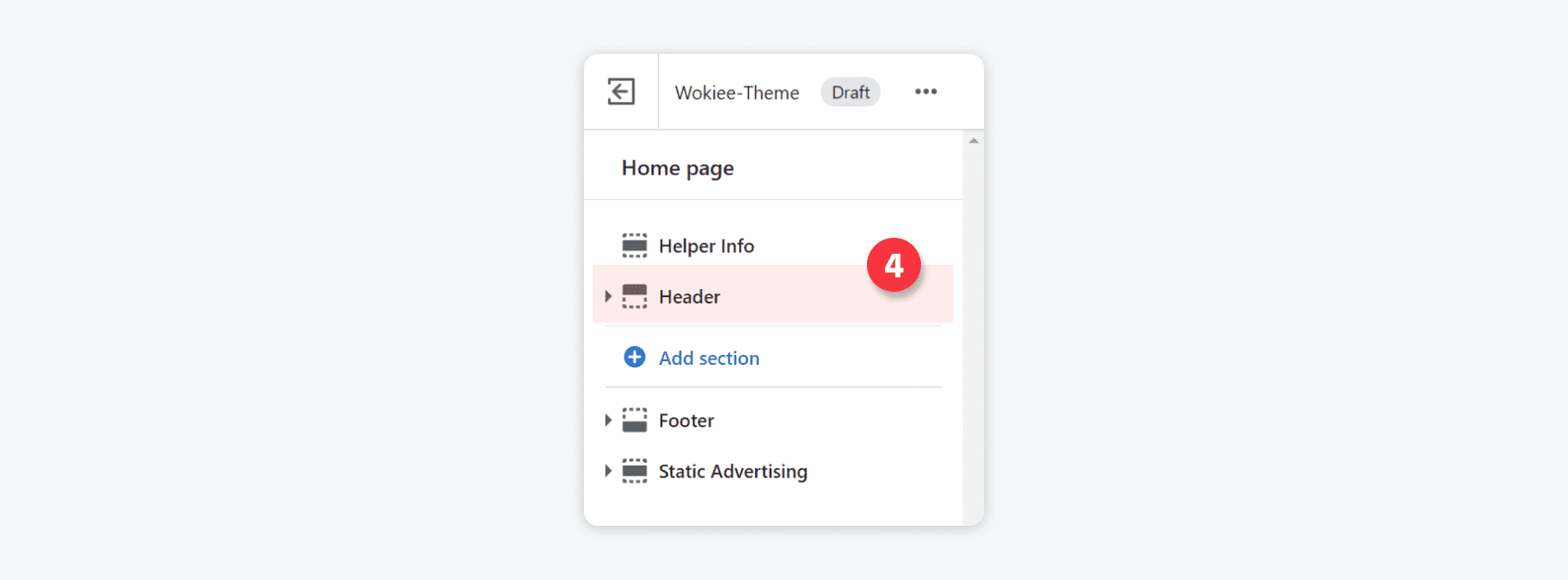
- Go to Online store > Customize > Sections > Header > Bottom section > Tab Languages menu Tab::

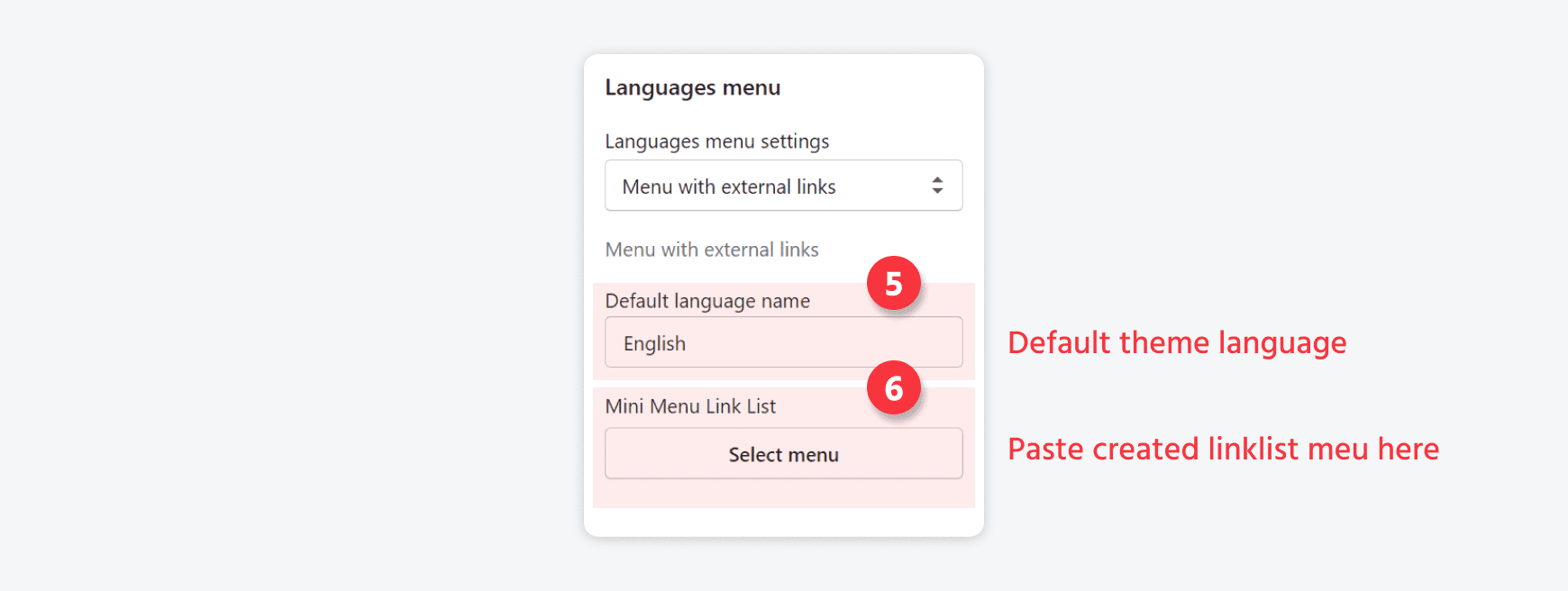
- Open the Languages menu tab. Write the default language for your store. Choose the created language menu:

- Result:


Settings
Open Settings tab
| Parameter | Value |
| Share image | Upload image |
| Image Favicon | Use image with size 32x32px |
| Show Preloader | Theme main preloader |
| Boxed Theme | Theme will have boxed header and footer |
| RTL Theme | Use theme in RTL mode |
| Show Breadcrumbs | Show breadcrumb block on pages below the header |
| Catalogue Mode | Hide top cart icon, "Add to Cart" button, Prices, Ratings |
| Show footer Instagram section | You will find this section in the “Sections” tab above the footer. |
| Show back to top button | Show the button in the right bottom corner. |
| Roundness | Make some elements as rounded |
| Terms and Conditions Checkbox | Using with the checkout button |
| Ajax "ADD TO CART" | Use the “ajax add to cart” button |
| Wishlist in Theme | Enable the "wishlist" option in the theme |
| Compare in Theme | Enable the "compare" option in the theme |
| Buy in One Click | Works in a product page. This button does not work in the adding to cart functionality on collection pages. |
| Countdown Timezone | Select and paste your timezone |
| "ADD TO CART" Popup | Pop-up message. Works when product is added to cart |
| Review | Choose between: Default shopify review app and Ali Review. Shows empty stars. Works when product has no reviews |
| Navigation | Show links in a new window after click |
| Custom Code Field | For HTML, js, and others. Placed at the end of the main HTML file |
| First Product Variant Column is Images |
For the product options. Option are set as images. Images come from product admin variants images. |
| Use in the Listing Products | For the product options. It works on the product thumbnails |
| Show Unavailable Variants | Show/hide unavailable variants |
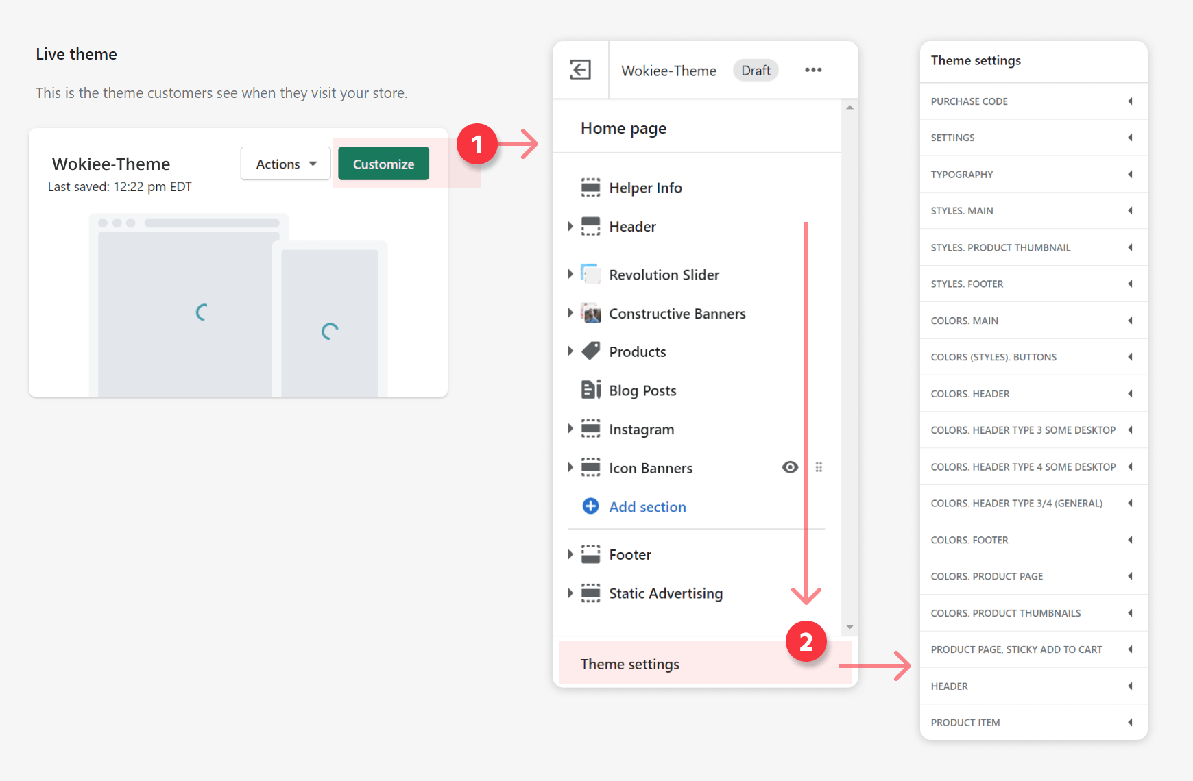
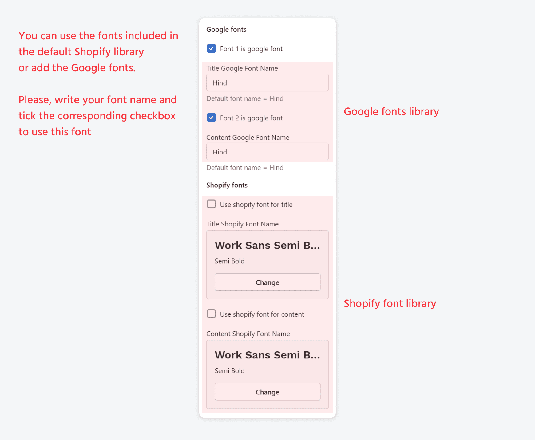
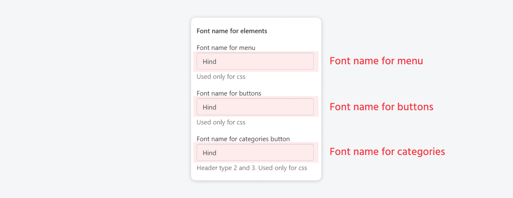
Typography
Please refer to the attached screenshots.
Open the Typography tab
-
Thickness

-
GOOGLE FONTS/SHOPIFY FONTS

-
FONT NAME FOR ELEMENTS

-
ADDITIONAL FONTS AND STYLES


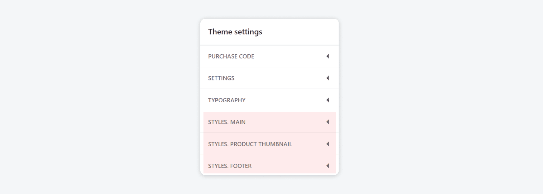
Styles
You may find base styles for quick customization in the Theme settings tab. Please refer to the attached screenshot.
Colors
Please refer to the attached screenshot to find base colors for quick customization.

Header
Please refer to the attached screenshots:
Open the Header tab

| Parameter | Value |
| Header Design | Theme supports 4 types of headers. Select your header type and edit it in the Header section in Theme customizer. |
| Open search in header "Default, with options" | Opens your search field. Works in the header "Default, with options" |
| Use submenu arrows for the main menu | Show/Hide arrows |
| MOBILE HEADER DESIGN: Use design mobile header in line | All elements in the line. |
| Use Static Header in the "Home Page" | Transparent header. Using with the Revolution slider |
| Content Color | Base color for all elements for the home page in the header |
| Content Active Color | Activates colors for all elements for the home page in the header section. |
| Show Static Logo | Show/Hide Static Logo |
| Static Logo | Works only with a static header on the home page. Replaces the main logo |
Product item
Open the Product Item tab
- Use image hover for second image: In the demo we use the size of the image equal to 1600х2000px
-
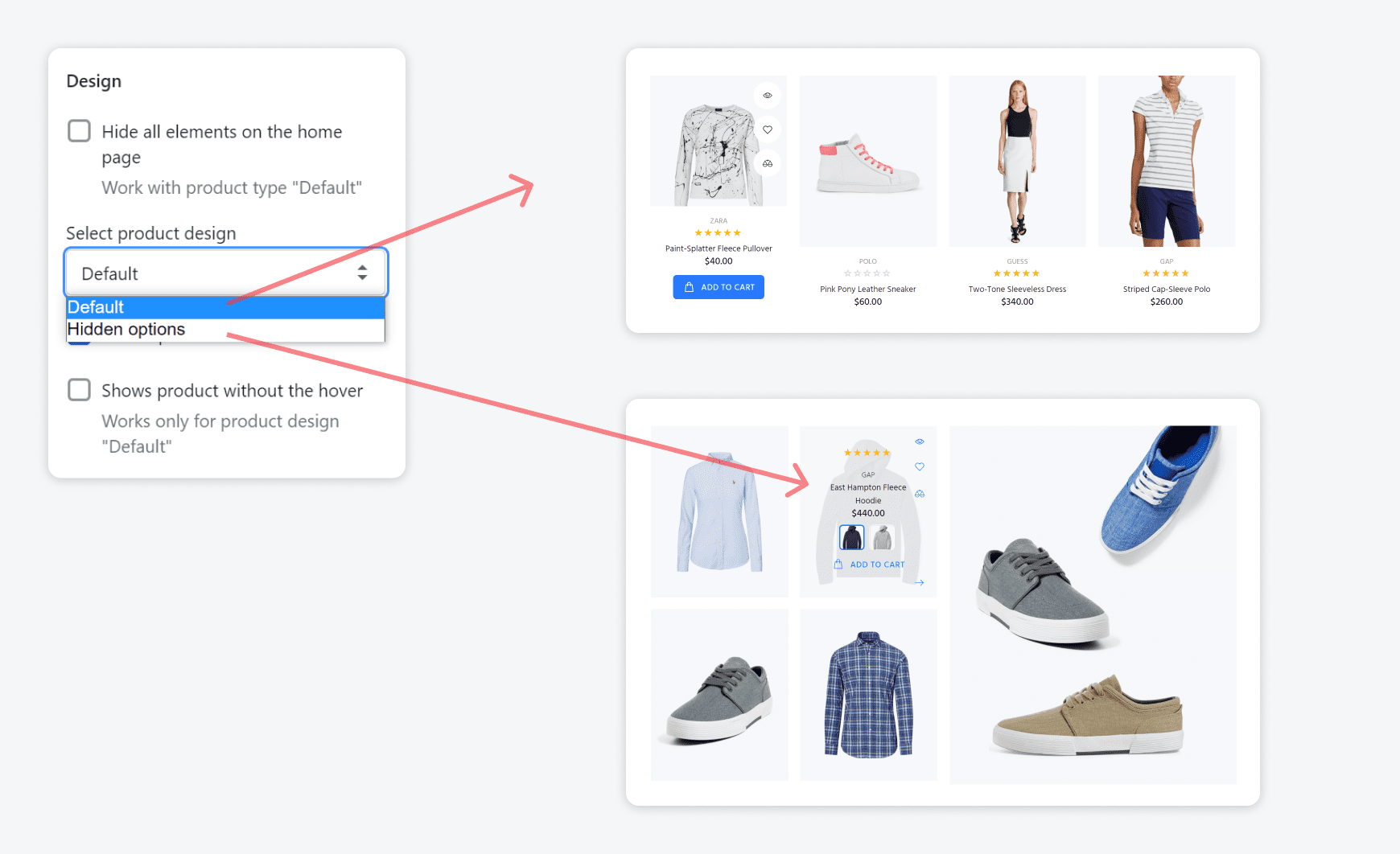
DESIGN

Parameter Value Select product design Choose between 2 types: Default, Hidden options Center product information Works with Default Design Shows product without the hover Works only for product design "Default" -
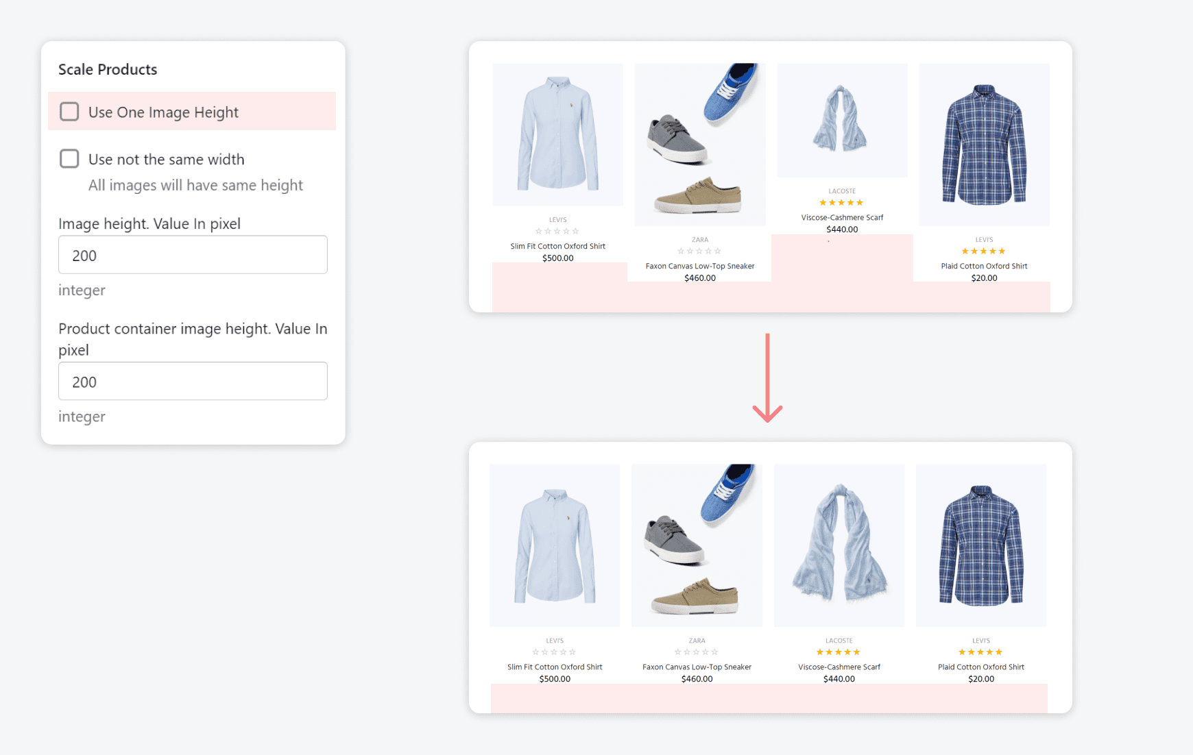
SCALE PRODUCTS: works in product cells on Collection pages, related products etc.
If you check the only first option you will see such resizing:

If you check both fields you will see such resizing:

-
NEW PERIOD/SALE BADGE

-
ELEMENTS

-
TRUNCATE PRODUCT TITLE

You can make smaller the product title to vertically align the product cells on collections pages etc.


Product quick view
Open the Product Quick View tab
You can show/hide elements in the Quick view block and options design.

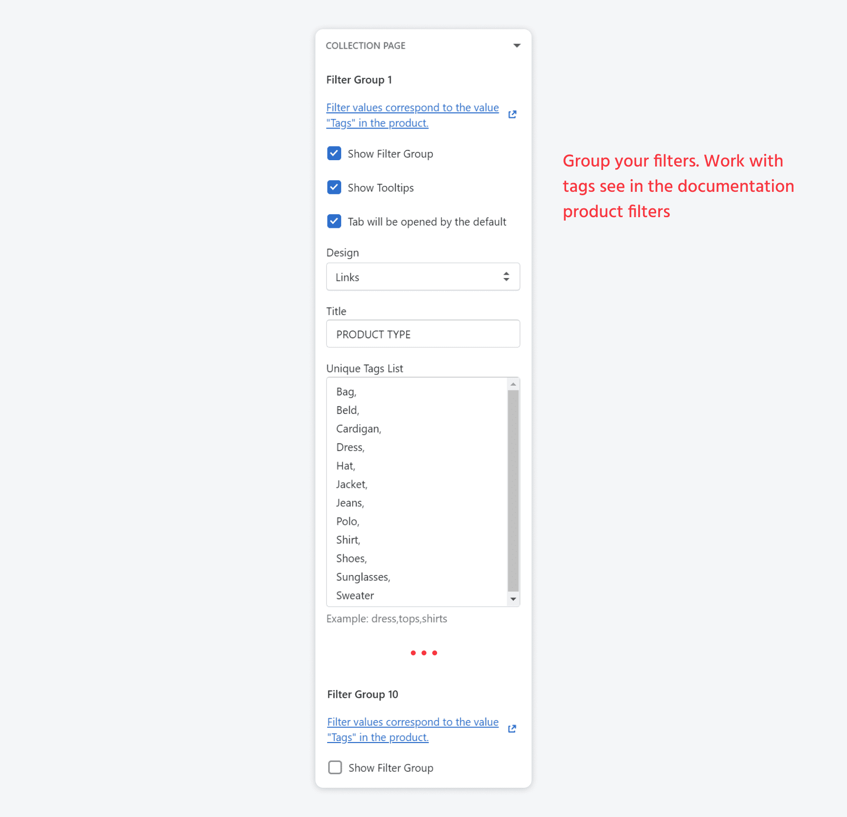
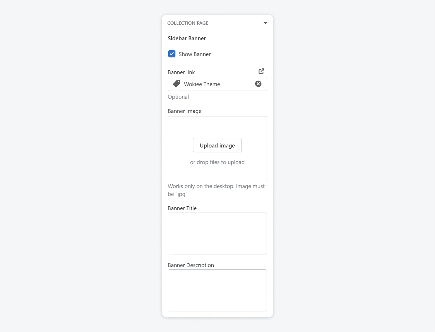
Collection page
Open the Collection Page tab
-
Main settings
Parameter Value Number of products per page Write any number Products in one row always View type for the listing page Show option One Row Enable button in one row Products In Column Choose between 2, 3, 4, 6 Pagination Choose between "Show More" button, Auto Scroll Infinity scroll. No Products Text Enter text Show product per page count Enable/Disable Show Collection Title Enable/Disable Show Collection Product Count Enable/Disable Show Collection Description Enable/Disable -
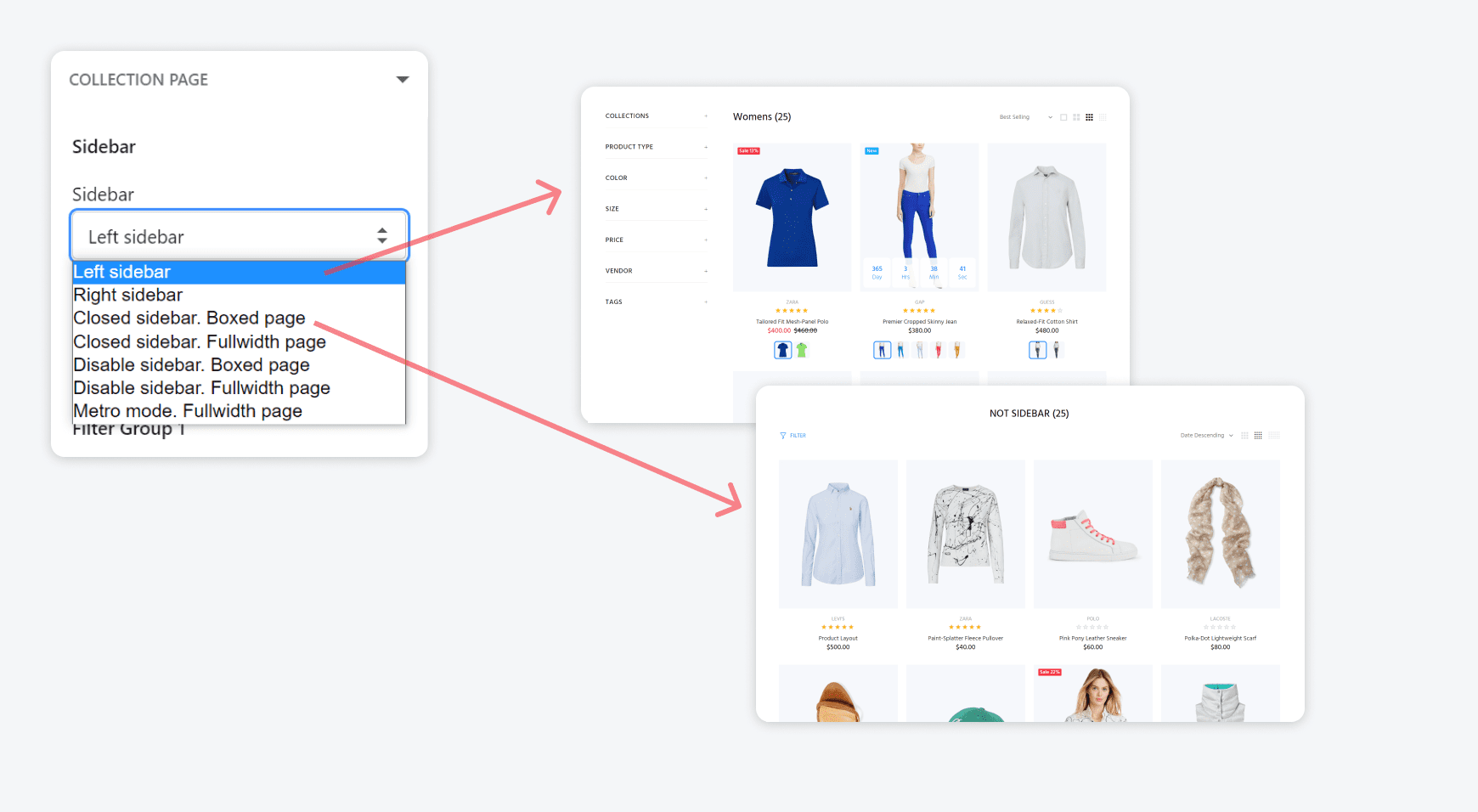
SIDEBAR: design, Show Tooltips in clear filters section

-
FILTERS
 Product filters
-
SIDEBAR COLLECTIONS TAB
Read details about the menu here
-
SIDEBAR BANNER


Product colors and textures
Colors and imagesNewsletter
Please refer to the attached screenshots:
Open Newsletter tab
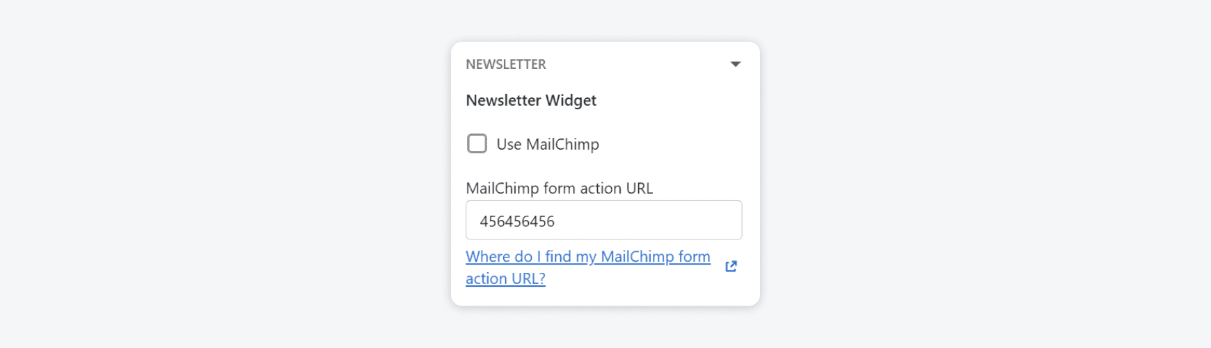
You may process the newsletters with Mailchimp service:
Include mailchimpWork with your Shopify account by the default:
Follow this steps to set up an email marketing campaign:
- With a newsletter signup, you collect email addresses from your customers and store them on the Accepts Marketing tab on the Customers page in the admin.
- Install an email marketing app from the Shopify App Store.
- Follow the instructions from a email marketing app to sync it with your list of customers who add their emails to your newsletter signup section. If your theme doesn't have an email signup form, then use an email marketing app that can add one to your store.
- Use the email marketing app to create and send newsletters to your customers.
Popup newsletter
Open the Pop-up Newsletter tab
SHOW/HIDE Popup Newsletter. Popup Newsletter options and texts.
SVG icons
You can add here SVG codes for some icons in the theme and parameters of them.
Checkout
Open tab Checkout
Setting up your online checkout - official documentation
Checkout/cart/account/login pages are not a part of the theme.
They are the default Shopify page.
Please ask your question from official Shopify support or search information in default Shopify manuals.