Header Section
Before you start to work with the header, we recommend you to watch the video with the instructions by the link below:
HEADER SECTIONHeader is customizable content.
By changing the header options you will have different designs.
You may add a top bar and a promo bar in your header section. Also in this section, you are able to create different variants of the drop-down menu for your main menu.
You can find the Header colors in Customize Theme > Theme Settings > Header Colors

Settings
| Property | Value |
| Enable sticky header | Enable/Disablesthe sticky header |
| Small header height | Enable/Disable the small header height |
| Main Menu | Select the default main menu from navigation blocks |
| Header fullwidth | Fullwidth screen container |
| LOGO: Show sticky logo on desktop | Show/Hide |
| Width of the sticky logo on desktop (in pixels) | Write width |
| Show sticky logo on mobile | Show/Hide |
| Width of the sticky logo on mobile (in pixels) | Write width |
| Logo Text | Write text |
| Desktop logo top offset | Write number |
| Logo Main | Choose image |
| Logo Main width (in pixels) | Write number |
| Logo Mobile | Choose image |
| Logo Mobile width (in pixels) | Write number |
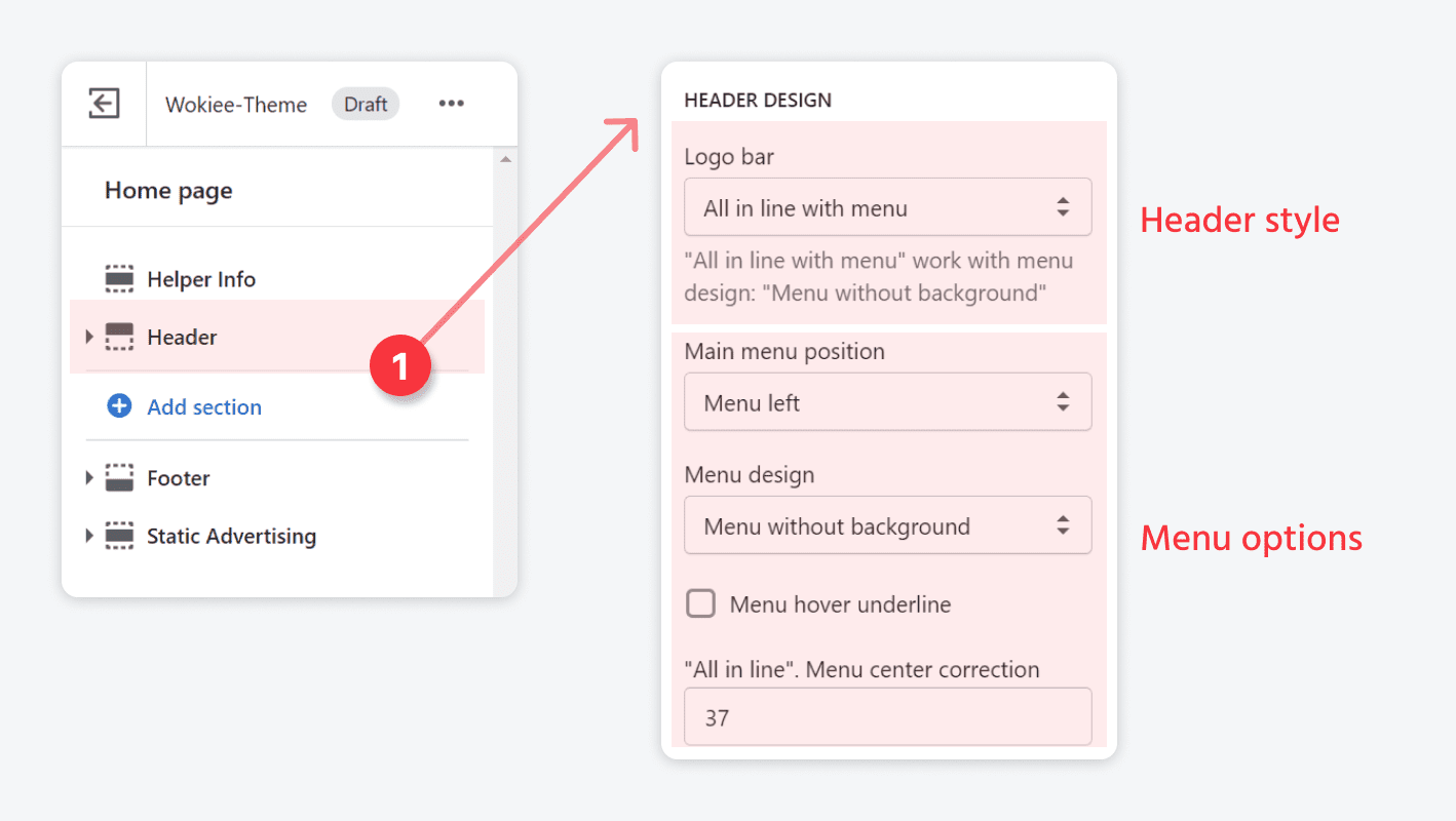
| HEADER DESIGN: Logo bar | Options with the placement of all elements:
|
| HEADER DESIGN: Main menu position | Menu left, right, center |
| HEADER DESIGN: Menu design | Menu without background, Menu with background, Menu with background and Item background |
| HEADER DESIGN: Menu hover underline | Show/Hide |
| HEADER DESIGN: "All in line". Menu center correction | Write number |
| HEADER DESIGN: Shrink main menu. Show items | Write number |
| HEADER DESIGN: Header height for logo in center | Write number |
| OPTIONS IN LOGO BAR: Show customer links | Shows/hides default options in the theme:
|
| OPTIONS IN LOGO BAR: Show options links | Language menu. Currency menu |
Additional content
Please refer to the attached screenshot:

Languages menu
| Property | Value |
| Languages menu settings | Use external links/Use Weglot APP |
| Default language name | Work with external links |
| Mini Menu Link List | Works with external links. Create a menu in the navigation |
Links:
- Languages menu
- Multiple currencies
- Top bar
- Information bar
- Simple submenu with title
- Simple submenu 2 columns
- Megamenu
Top bar settings

Promo bar

Header type 2, 3
You may find colors for the Header Type 2 in the tab Customization > Theme Settings > Header Colors
You may find colors for the Header Type 3 in the tabs Customization > Theme Settings > Header Colors, Header Type 3 Some Desktop Colors, Colors. Header Type 3/4 (general)
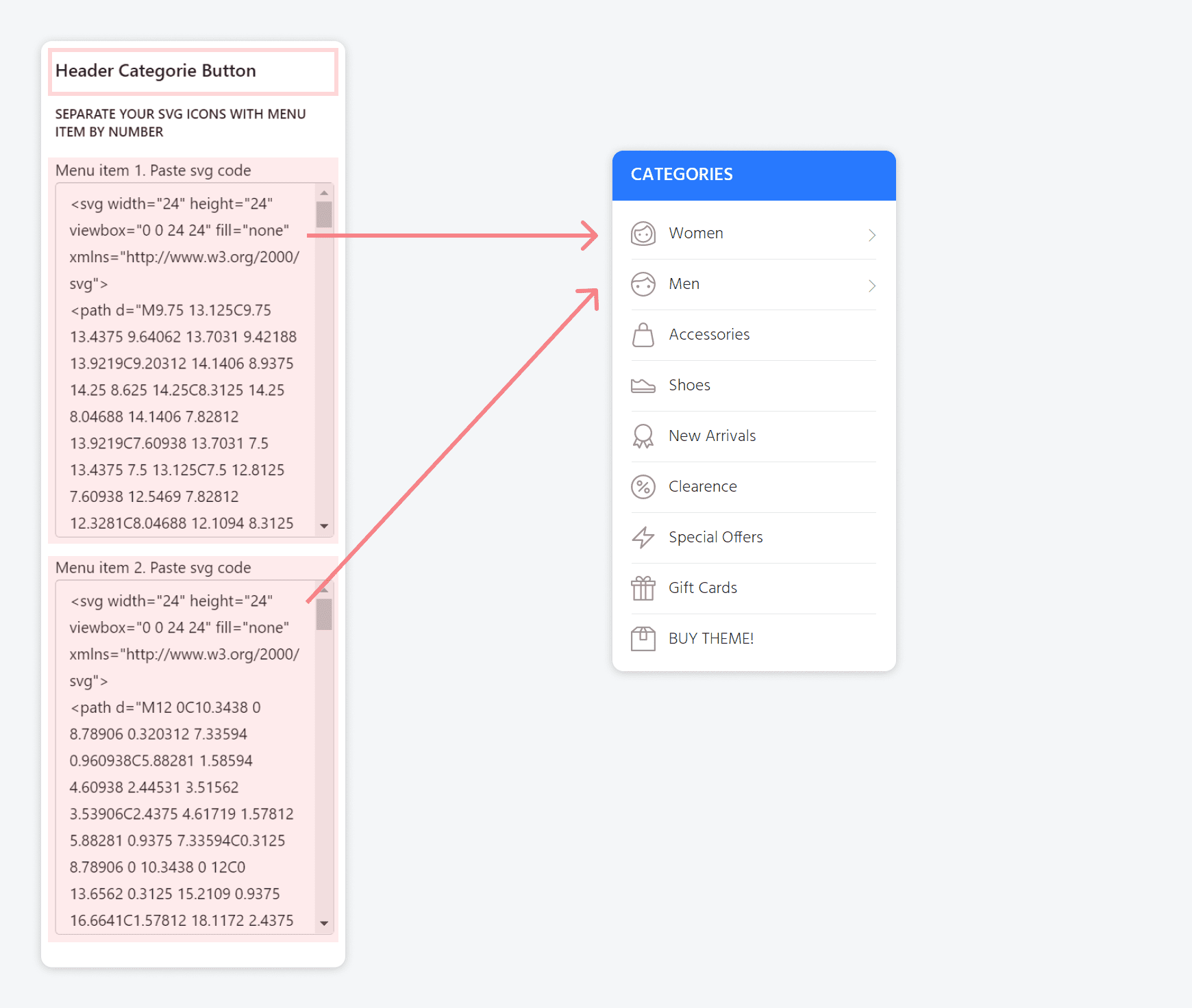
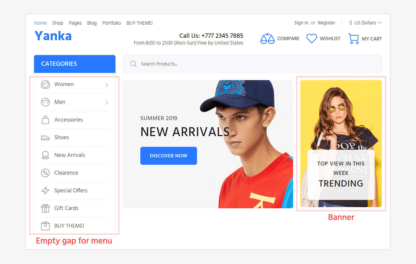
- You may enable or disable "Categories Button" in the "Header type 2 and 3".
- You may enable "Header type 2 and 3" in Customize Theme > Theme settings > Header > Select header design
- You may use SVG icons with size 13x15px in the "Categories Button" menu.
Paste your code with svg icon in special field in the categories button section

- SVG icon generator link(PNG to SVG)
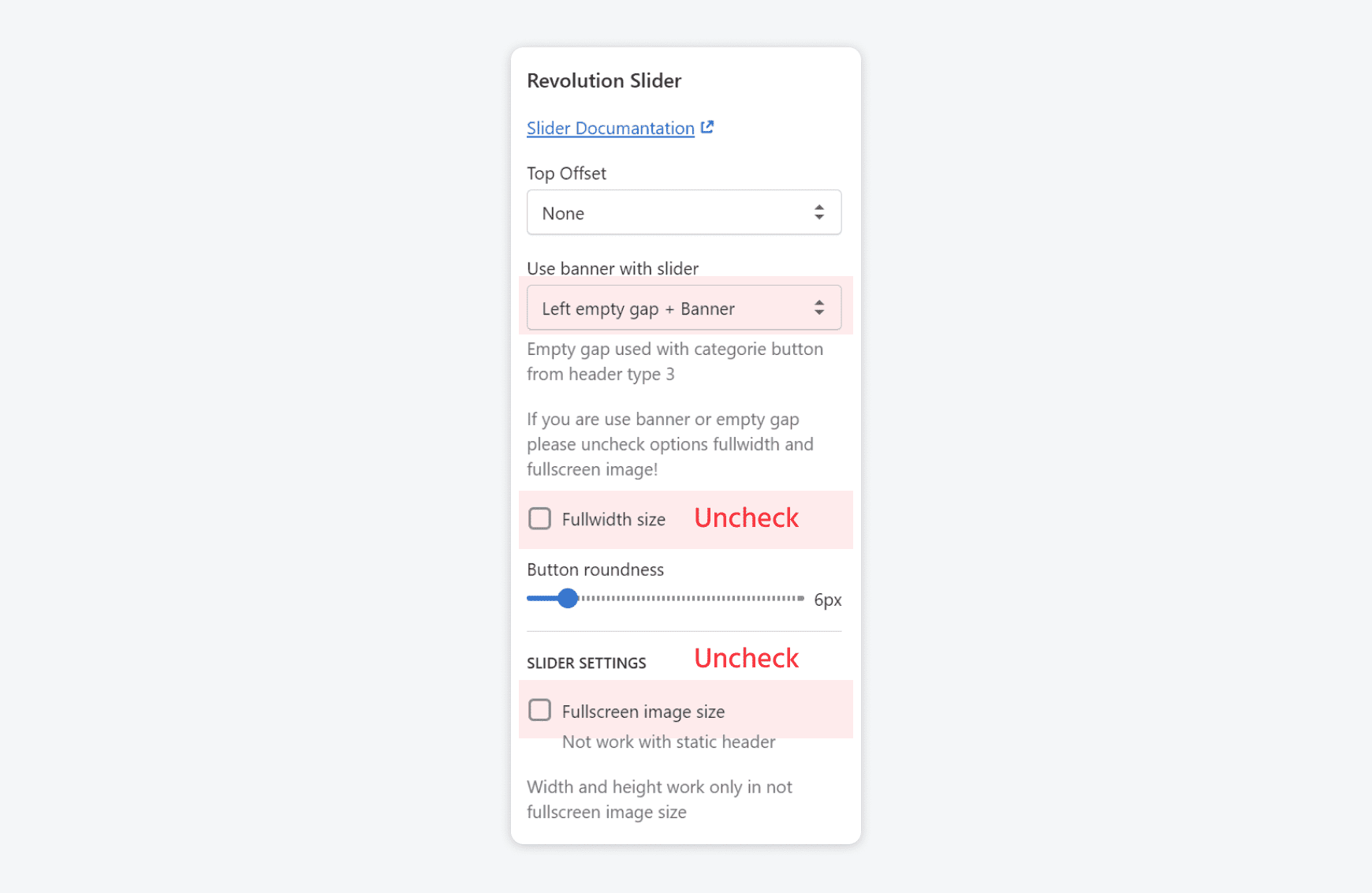
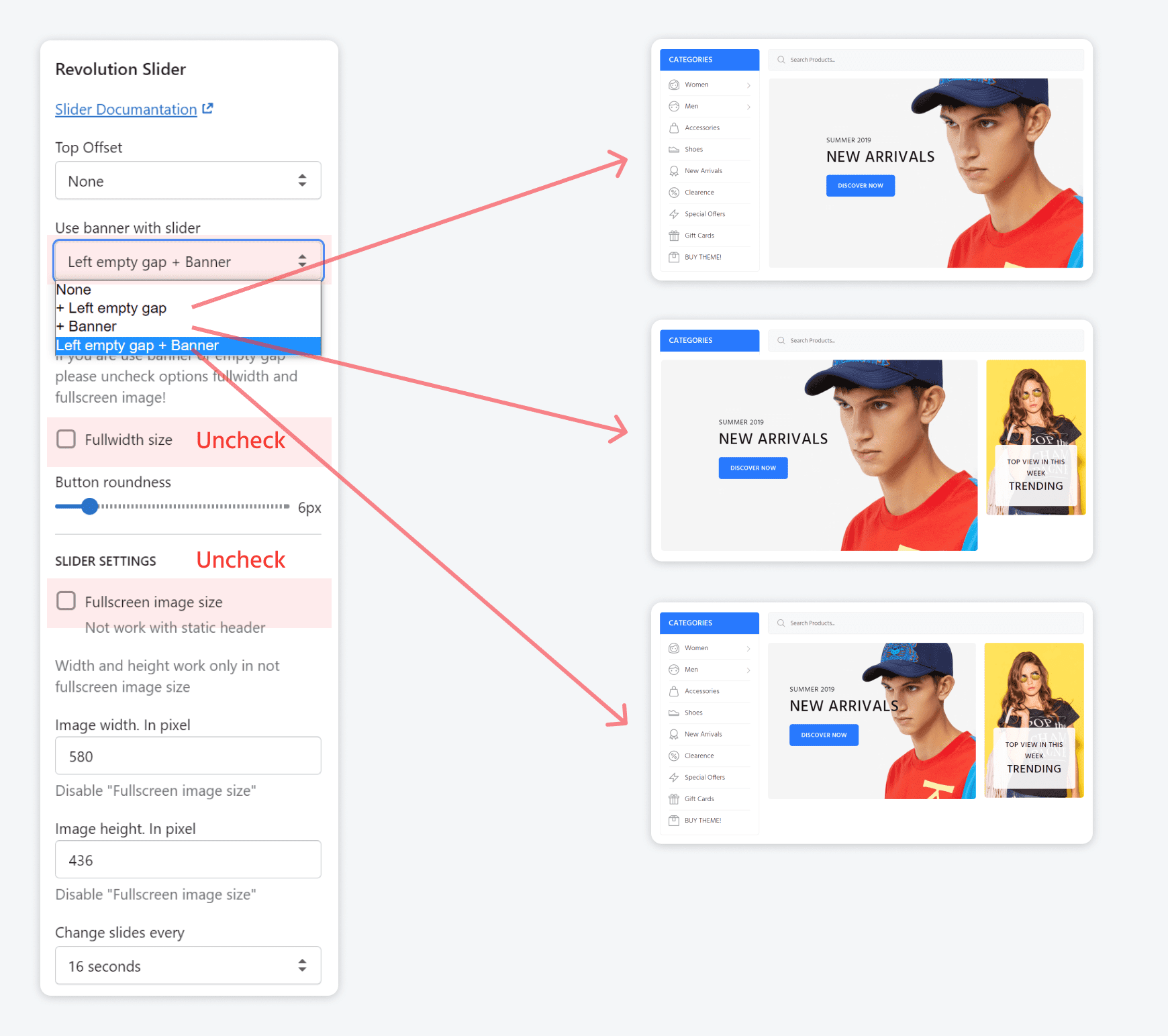
Revolution slider variants (* can work without header type 2 or 3)
-

To have the type above make the following settings:

-
Please pay attention what settings have to be done and what Revolution sections can be got

Header type 4
Header type 4 overviewYou may find colors for the Header Type 4 in theCustomize theme > Theme Settings > Header Colors, Colors. Header Type 4 Some Desktop, Colors. Header Type 3/4 (general)
- You may enable or disable "Menu with Icons" in "Header type 4" you can enable or disable "Menu with Icons".
- You may enable "Header type 4" in Customize Theme > Theme settings > Header > Select header design
- In "Menu with icons" menu you can use svg icons with recommend size 36x36px.
Paste your code with svg icon in special field in the "menu with icons" section - SVG icon generator link(PNG to SVG)